GoodBarber
  • Pricing
LoginCreate an app
  • TOP APP TRENDS
  • eCommerce
  • Memberships
  • Chatbot
  • Online Courses
  • Bookings
  • Travel guide
  • Events
  • Content Creators
  • Pickup & Delivery
  • THE ESSENTIALS
  • Newspaper
  • Radio
  • Schools
  • Faith
  • Organizations
  • Restaurant
  • Grocery
  • Custom apps
  • Employee Communication
  • GoodBarber for ResellersYou have an agency and you want to resell our solutionsDiscover the offer
  • Custom developmentGoodBarber builds the app that fits your unique business needsRequest a quote
Browse all solutions
  • NO CODE APP BUILDER
  • Content apps
  • eCommerce apps
  • Extensions Store
  • The ultimate dashboard
  • AI-Assisted Creation
  • MCP Server
  • TECHNOLOGY
  • Native app (iOS & Android)
  • Progressive Web App
  • Design system
  • Developers
  • GoodBarber logoWHY GOODBARBER?
  • GoodBarber DNA
  • GoodBarberheart emojiDesign
  • No-Code App Builder
  • Privacy & Compliance
  • PRODUCT RESOURCES
  • Blog
  • GoodBarber Academy
  • Video tutorials
  • FAQ
  • Updates & Releases
  • Online help
  • The ultimate GoodBarber guide
  • TOPICS
  • How to create an App
  • How to test an app with TestFlight
  • How to create a Google Developer Account
  • How to convert an excel file into an App
  • App builder: make stunning mobile apps without coding
  • Awesome supportReal experts to help you at every step of your mobile app journeyDiscover
  • resellerMOBILE APPS RESELLERS
  • Reseller program
  • How to sell an app?
  • Reseller testimonials
  • Reseller Blog
  • compassDISCOVER
  • Use an app builder to sell apps
  • Download our agency guide
  • Apple & Google's marketing tips to sell their products and services
  • GBTC: Publish your app with easeDiscover GoodBarber Takes Care and simplify the app publication process for both the App Store and Google Play. Let us handle the technical details for you.Learn more about GBTC

Design System

Overview
  • Foundations
    • Layout
      • Grid
      • Spacing
      • Breakpoints
      • Layers
    • Graphic elements
      • Color
      • Typography
      • Images Aspect Ratios
      • Icons
  • Atomic Components
    • Color atom
    • Font atom
    • Image atom
    • Gradient atom
    • Shape atom
    • Shadow atom
    • Size atom
    • Border atom
    • Blur atom
    • Overlay atom
    • Immersive feedback atom
  • UI Elements
    • Action
    • DateBullet
    • Distance
    • Duration
    • Item
    • Item Icon
    • Item Indicator
    • Item Label
    • Media
    • Pager
    • Play
    • Player
  • UI Components
    • Background
    • Text Field
    • Dropdown
    • Date & Time Picker
    • Checkboxes & Radio Button
    • Button
    • Thumbnail
    • Form
    • TabBar
UI Elements icon

UI Elements

UI elements are the building blocks of our components. Each element combines atoms of the design system to do a single job. Assembled together, elements form the components of the app.
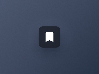
  • An action button with a bookmark icon

    Action

    The contextual button to act on a piece of content.
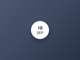
  • A date bullet showing a day and a month

    DateBullet

    The date of an event, at a glance.
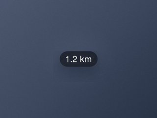
  • A distance label on its own

    Distance

    The label that shows how far a place is.
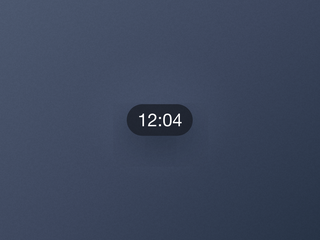
  • A duration label on its own

    Duration

    The label that shows how long a video lasts.
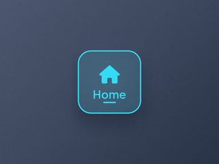
  • An Item and its child elements

    Item

    The structural unit of a navigation entry, with its child elements.
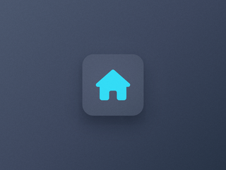
  • The Item Icon and its background layer

    Item Icon

    The pictogram of a navigation entry, on its own background layer.
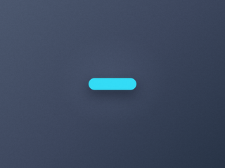
  • A tiny indicator on its own

    Item Indicator

    The marker of the selected entry of a navigation.
  • An Item Label on its own

    Item Label

    The text of a navigation entry, in three sizes that adapt to each device.
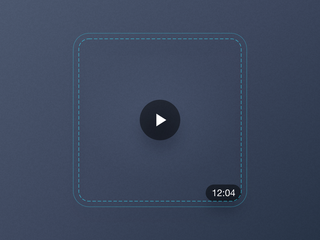
  • A media container holding a play icon and a duration

    Media

    The container that anchors elements over a cell's image.
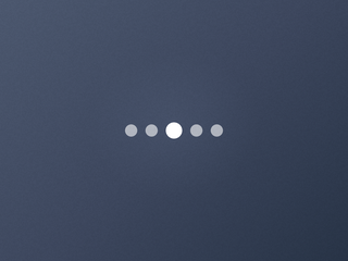
  • A pager on its own

    Pager

    The dots that show where you are in a carousel.

  • A play icon on its own

    Play

    The icon that signals playable media.
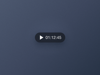
  • A player control with a play icon and a timer

    Player

    The control that plays and pauses audio, right from its cell.

  • COMPANY
  • About Us
  • Awesome support
  • GoodBarber DNA
  • Startup Studio
  • Jobs
  • Press
  • T&C
  • Privacy Policy & GDPR
  • Contact us
  • PRODUCT
  • eCommerce app builder
  • Mobile App Builder
  • PWA Builder
  • Extensions list
  • App Reseller Program
  • Pricing
  • Users feedback
  • Developers
  • Custom app development
  • Glossary
  • ALTERNATIVES
  • GoodBarber vs Adalo
  • GoodBarber vs Bubble
  • GoodBarber vs FlutterFlow
  • GoodBarber vs Glide
  • GoodBarber vs Lovable
  • See all comparisons
  • Best app builders 2026
  • SOCIAL
  • Facebook
  • Instagram
  • X
  • YouTube
  • Linkedin
  • Threads
  • TikTok

© GoodBarber - Since 2011 - Made in Corsica

  • Language
  • en
  • fr
  • it
  • es
  • pt
  • de
  • nl
  • fi
  • sv
  • no
  • da